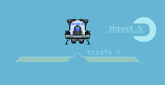
Experimenting with a futuristic, moving UI
Trying to set the mood with some fancy sci-fi like UI that follows the player. This post is part of an ongoing series about Flying is Hard.After I got my ECS stuff finished I needed a small break from heavy coding and scaffolding, so I decided to play around and get some UI created to visualise the players inputs. Since the game focuses on movement via jet engine thrust, I keep having a sci-fi vibe ringing around in my head; so I tried to replicate the stereotypical 'futuristic space ship HUD' look with slightly transparent light greenish-blue and yellow colours.

I figured attaching the UI to the main character would allow the player to get immediate feedback in terms of touch force and horizontal position without forcing them to lose focus on their movement. We are talking about 3D Touch after all, and I've found having this force reference to be super valuable when trying to maintain a steady path while traversing horizontally.
Hooking it up wound up being a pretty simple job thanks to the built in Image Fill feature of Unity UI Images and my ECS setup.
I also added off-screen detection to the thrust indicator so that it flips to the other side of the character instead of going off-screen, which was the trickiest part of the entire process. There was quite a lot of vector translation between world space, screen space and local space and while I wound up coming up with a working solution, it probably will need to be revisited to make the orientation flip a little bit more smooth and polished.
On that note, I want to give a huge shout to RectTransformUtility.ScreenPointToLocalPointInRectangle! This is the second instance where it's been invaluable, and is something I've worked to replicate on my own before finding this super awesome utility method. Hopefully knowledge of it will save someone else endless hours of frustration! :)
That wraps up this log. Stay tuned for more Flying is Hard logs, and maybe follow along on twitter @bengsfort.