Finding an aesthetic
3D? 2D? Pixel art? Flat? SO MANY CHOICES. This post is part of an ongoing series about Flying is Hard.Another day, another hiatus from major gameplay coding for design! A pattern isn't developing, is there? This time I focused on playing around to try to translate the vision I've got for this in my head to something on the screen by experimenting with a couple different art styles to determine which one I wanted to move forward with. I decided to focus on the first section of the first stage of the first world so I could quickly iterate with different art styles with minimal effort.
World 1 inspiration
My inspiration for the first world comes from my recent trip to Mikkeli, Finland for holiday. It was the first time I've driven through Finnish lakeland and the entire time I was absolutely awestruck. In many parts of the drive there would be large rock formations topped with dozens of very tall pines, and I wanted to attempt to try to capture that with the first world of the game.
The first stage is a sort of tutorial stage in that it is meant to teach the player how to play the game in a mostly safe environment. The sections reflect this:
- Section 1: Two large cliffs on both sides and the unlock point right in the middle, teaching the player to use thrust to move up.
- Section 2: A sort of zig-zag section that teaches the player to move horizontally.
- Section 3: A section traversing through a gap in cliffs, teaching the player to play with the thrust levels to move down.
Starting with the background
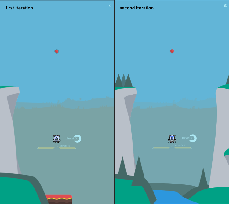
To kick off this art style party I decided to whip up some backgrounds to have off in the distance. I figured I'd need them at some point anyway, so why not start now so I have some sort of reference for the rest of the artwork? I settled on the following two layers of rolling hills, staggered so that I could hook them up to a parallax script and have them add a little extra something to the scene.

After two iterations of the hills I'm very pleased with how they came out! With those out of the way I turned my attention to the main environment of the stage.
Iteration 1 & 2: 3D artwork
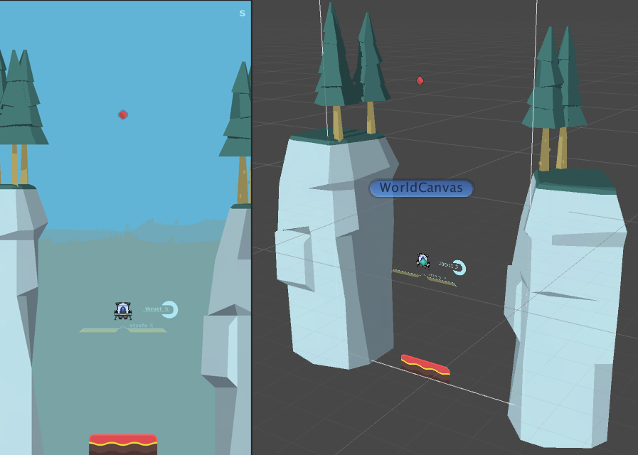
Despite all of my recent attempts at artwork being in 2D, as a teenager I worked exclusively in 3D. I made a lot of maps for Counter-Strike and Half-Life 1 & 2 mods as well as random 3D artwork, but haven't really touched 3D since I was no longer eligible for the free student edition of 3DS Max. Recently I've been feeling an itch to try it out again, so I felt now would be the perfect time. Despite previous attempts to figure out Blender ending with rage quitting, I decided to load it up and give it a go now that I'm quite a bit older than I was when I last tried it. After a couple days practicing making fences and other stuff like that, I decided to try to make a cliff for this first world.

I topped the cliffs with some lovely Kenney nature assets and wrote a 3-step cel shader and got the above result, but wasn't really happy with them. I decided to see if it was just my cliffs that I didn't like or if it was just 3D in general, so I tossed in some of the cliffs provided by Kenney's asset pack to see what it would look like with those.
While it looked fine, I just wasn't feeling it. I also felt that the iteration time was more than I would like, so I decided to start looking into 2D.
Iteration 3: Flat 2D
With all of my recent work being pixel art I wanted to branch out a bit and try something a little bit different, so I ditched Aseprite for a moment and jumped into Sketch to try to make some flat/minimalistic style cliffs. I started with one side to see if I could get something that fit what I had in mind, and came up with the image on the lower left of the image below. I liked it, but I wasn't 100% sold just yet. So I decided to follow through and make something resembling a more cohesive scene before I made a decision; so I made some tweaks to the first cliff, added another one and also scattered some trees around.

I was really into it and am very pleased with how it turned out. The general aesthetic plus the iteration time, and not to mention that I'm just much more comfortable with 2D than I am with 3D, made me decide to go down this route for the artwork. I tried to capture the same sort of minimalistic look that Alto's Adventure does so well; not sure that I nailed it but I'm pleased with it for now.
Making it a little more lively
Next up I wanted to give the scene a little bit of life, so I turned my attention to making a breeeeeze through the treeees. There are a couple ways to achieve this, but I decided to go with handling the breeze animation via a shader; that way I can easily add support for the trees swaying faster when the player gets near them in the future. Plus a friend of mine keeps telling me that I need to do more shaders, so I figured I'd follow up his advice!
Adding a mask to allow for sprite scaling
I started out by writing a shader that would allow to scale the trees as much as I wanted without quality loss, just to get the hang of things. It was actually surprisingly easy (even for me and my rubbish shader skills); I just made a fragment shader that checked the alpha of the current pixel from the UV's against the specified colours alpha, set the alpha to 0 for everything that was not at the target alpha, than added some antialiasing on the alpha 100/alpha 0 neighbors.

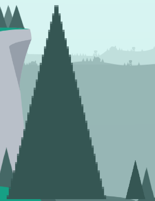
The tree on the left is at 5x scale whereas the tree on the right is 1x scale. By sampling a target colours alpha and then resetting the alpha for the pixels determined as part of the sprite after creating the mask, this will still allow me to use this shader on things that are supposed to be slightly transparent. The only downside to this approach currently is it only works for solid colours, so I need to figure out a way around that so that I can use it on the cliffs as well, as when I try to use it on multi-colour objects I have to sample the pixel colours from the image, and those have scaling artifacts that still show up slightly.
DooOO thE waaAvE
Next up was making the thing sway, which turned out to be a bit of a faff due to unforeseen Sprite Renderer issues + shaders. I wound up making the shader have configurable properties for sway speed, intensity, and stiffness; and then I shift the UV's/verts around based on those properties and the vertical position of the vert/uv. This allowed me to play around with the settings within the editor so I could find the values that would work the best for each tree.
This worked great at first! I added the material with the shader onto my sprite renderers and by the time I finished most of the left side of the screen things were looking pretty decent. That said, I started to notice an issue the second I tried applying the shader to the trees on the right side where the centerpoint of the trees would change and all of the trees would start flying around the screen instead of staying in place, as if the shader was treating the center point for the trees all in the middle of the screen instead of the actual middle point for each tree. I tried swapping some of the trees to a quad mesh instead of the built in sprite renderer and voila, everything worked as expected.
I'm not sure if this is intended behaviour or what, but it seems as though sprite renderers attempt to use the same shader instance for all sprite renderers that have similar parameters--namely scale/rotation. If I had two trees that were the same scale/rotation they would behave this way, if I had two that were different scales they would behave somewhat fine; but switching to mesh renderers + quads fixed it in all cases with no other issues.
Once I figured out that little quirk, I set converted the rest of the trees and had a mostly-completed scene.
I'm super pleased with how this turned out! Next steps will be adding a script that makes the trees sway faster whenever the player is near them and writing a shader that will add some movement/liveliness to the river going through the center of the background.
Thats it for now! Stay tuned for more Flying is Hard logs, and maybe follow along on twitter @bengsfort.